Books and Other Publications
“You can't judge a book by its cover”. I respectfully disagree. Maybe not so respectfully.
A great book cover attracts and intrigues.
It draws in a potential reader and compels them to learn more.
It makes them yearn to read the writer’s words.
I hope my work compels you to learn more about me, and yearn to have your words represented by my work.
Blue is the Color of Heaven
Book Cover
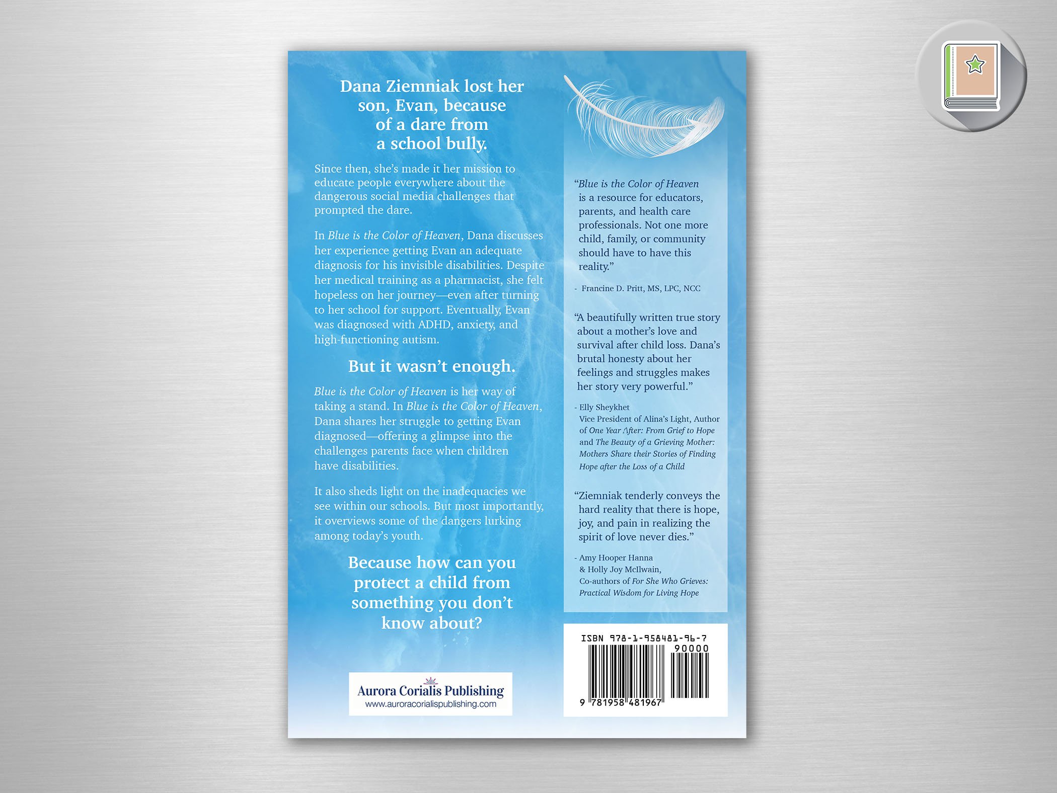
This is the story of a mother’s connection with her son through getting him the diagnosis and help he needed -and now through his signs to her after his tragic death.
Through Evan, Dana knows that blue is the color of Heaven, and that there is love and hope beyond a tragedy such as this.
Evan was dared by a bully to do a viral online challenge, and that is when Evan’s short life came to an end. Dana’s mission is to tell Evan’s story, and to educate people about the dangerous social media challenges.
Her important story was brought to the national stage on the Dr. Phil Show
as seen on the
DR. PHIL SHOW
A Dove in the Shadows
Book Cover
The story of a woman who pulled herself out of a broken mental health system is about as inspirational as it gets. I wanted to do her story justice and I’ll admit, I struggled with her title a bit! She was partial to beach imagery, which doesn’t lend itself to shadows.
The image of a dark (shadowed) silhouette of a woman with face turned toward the sky with a beautiful sunrise called to me… I added a horizon of darker water from which the woman could emerge, and things started coming together.
Now on to the dove - I found an appropriate dove, colorized to fit - and had it flying away from her as if she had released it… and it didn’t FEEL right. It was as if peace was leaving her… so I turned the dove so they FACED each other. I then connected them with a spiritual circle and I knew I had something as special as this book.
From Burdened to Balanced
Book Cover
The subject matter of combining Scripture and Science was going to be a challenge no doubt. I attacked it from many symbolic angles before this balanced, serene image of concentric ripples in a pond sparked the concept. Water was the answer.
Water can be represented as stormy and problematic, or serene and calm. Burdened or Balanced! My fingers couldn’t move fast enough once this concept formed in my mind.
The Mindful Bride
Book Cover
Wedding Coordinator, Joanne Cain had some advice to offer to brides to attain a calm and mindful process while getting to the big day. She compiled that information so every bride who reads this book can achieve this …
“The Mindful Bride embodies a sense of presence, calmness, and awareness as best they can throughout the entire wedding process. It’s about being attuned to emotions and the experience, savoring each moment rather than being consumed by stress or external expectations.”
The woman on the cover is one of Joanne’s actual brides… exuding the confidence and calm of The Mindful Bride. This stunning image was enhanced with a complimentary sparkly background and an elegant font to bring the Wedding mood to this cover!
Surrender to Truth
Book Cover & Book Title
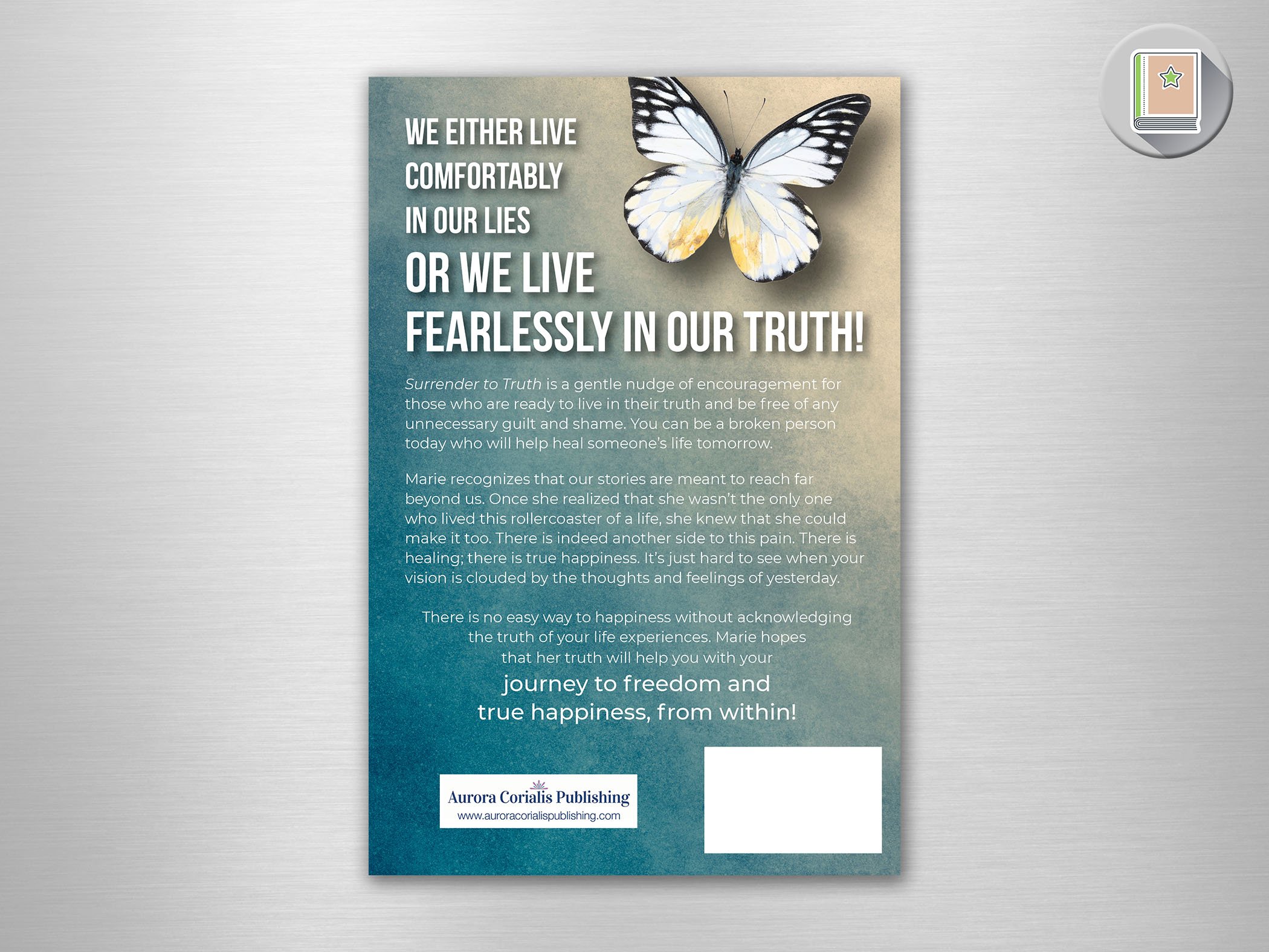
I actually named this book. I read it and came to a chapter called “The Surrendering” that was a turning point in the book. It was an inspiring read about overcoming trauma.
The butterfly was her idea - in honor of her grandmother. And a butterfly worked to represent her transformation.
This butterfly was just beautiful and I found this unique textured background and it all just came together. I love the serenity and beauty of this cover - showing that both are possible after trauma.
Steps To Success
Book Cover
Denise Galloni’s title required something bold. The author’s stories demanded a symbol of their AHA! moments - and what better way to do that than with a “eureka” lightbulb!
This bulb has the added interest of facets - like the facets of each story and the light that each author brought to this inspirational book
Of course the steps to success are represented here… all in Denise’s brand colors, of course!
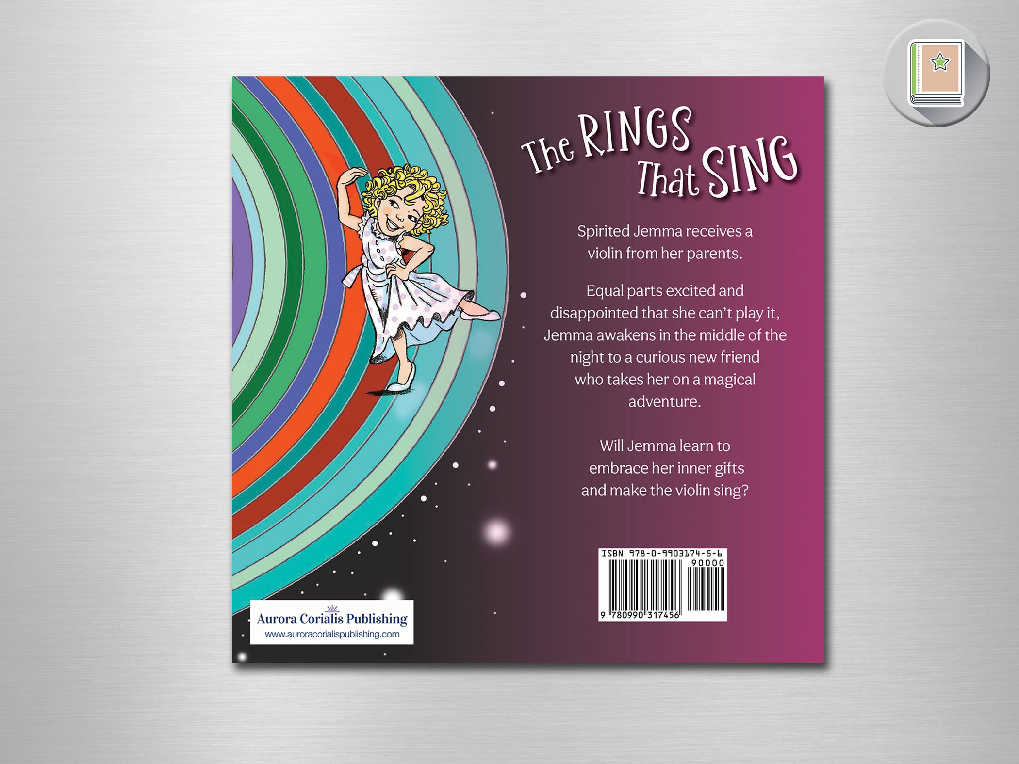
The Rings That Sing
Book Cover Layout and Book layout
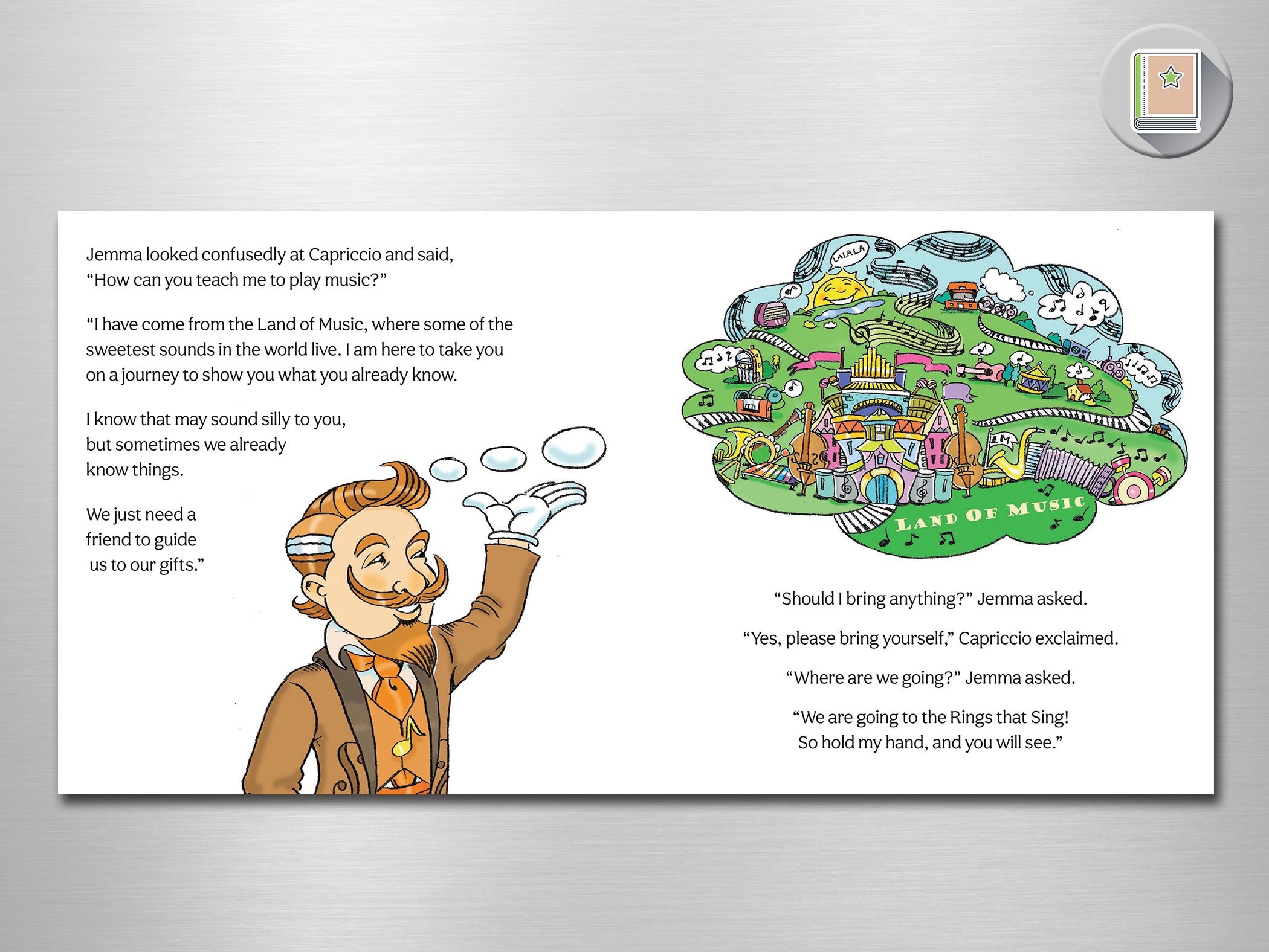
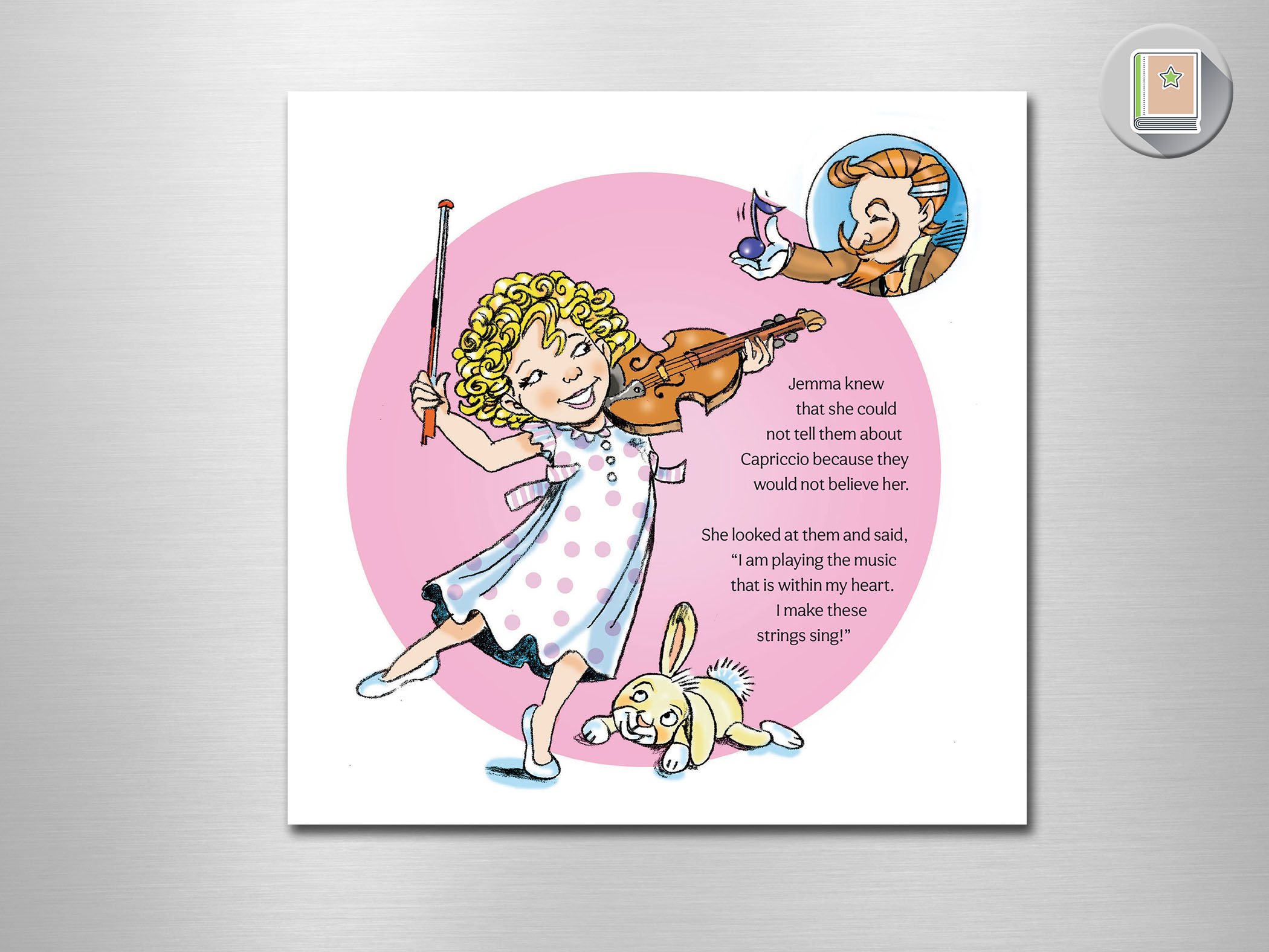
A children’s book that came to me as text only. Then the illustrations were provided and I was honored to design the text into the images and wrangle both into the specs provided by Ingram Spark.
A cover illustration was not provided, so I took an appropriate image, cropped it in an interesting way to show the fun and musical theme of the story. Then I used another illustration in the background to make sure that the "outer space” aspect of the story was represented.
I used an infusion of magenta to really draw the eye and it was complete!
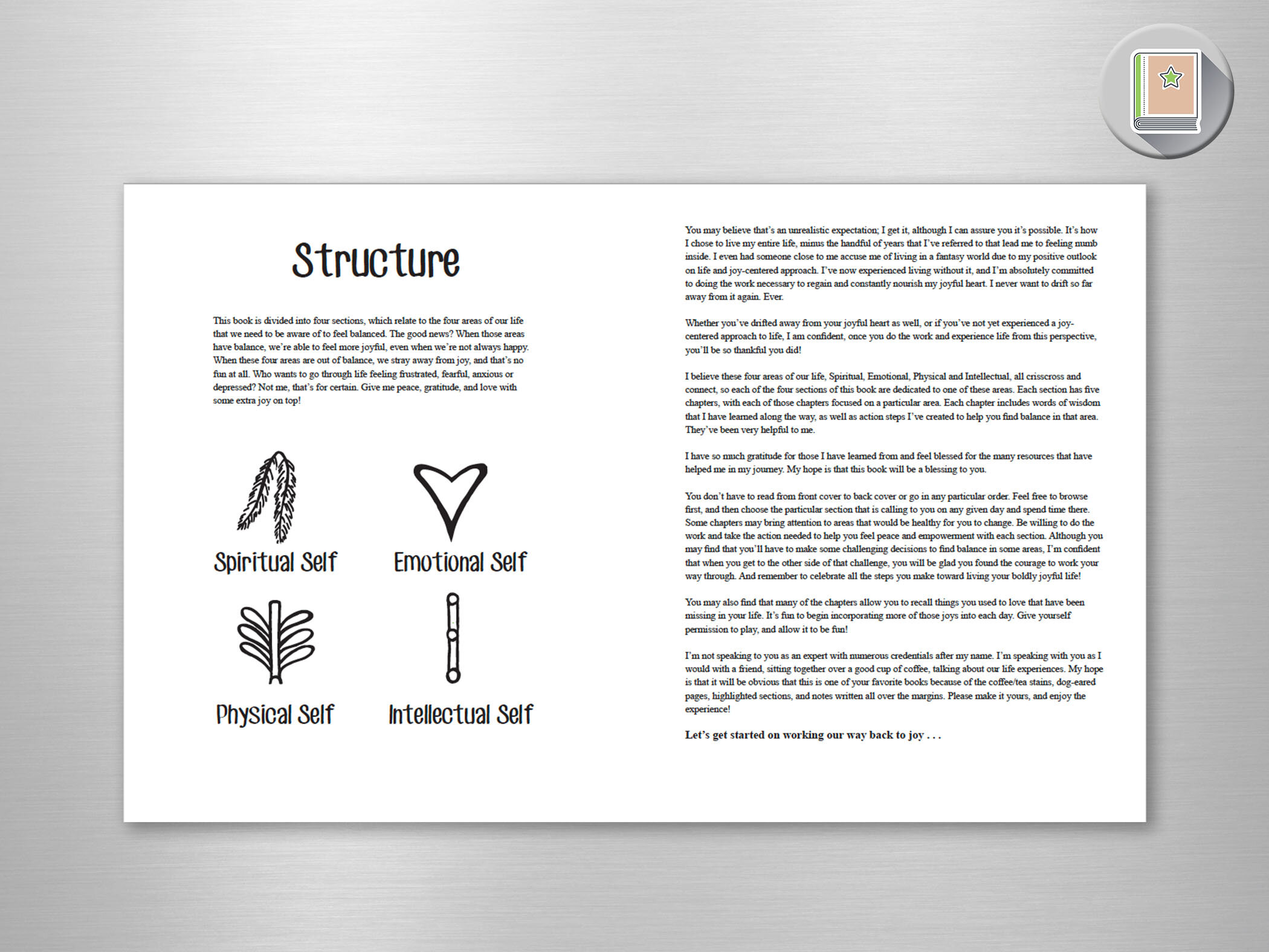
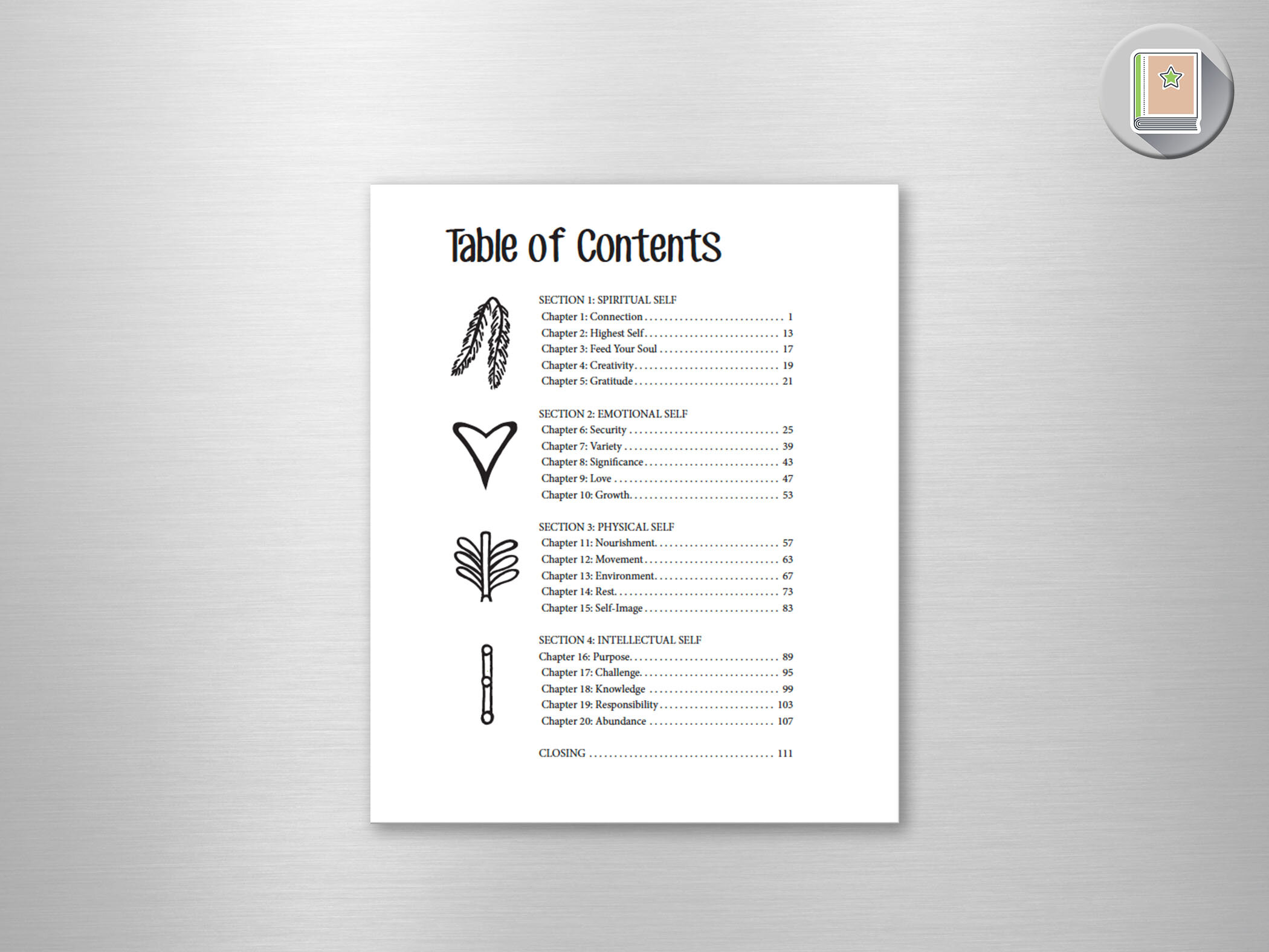
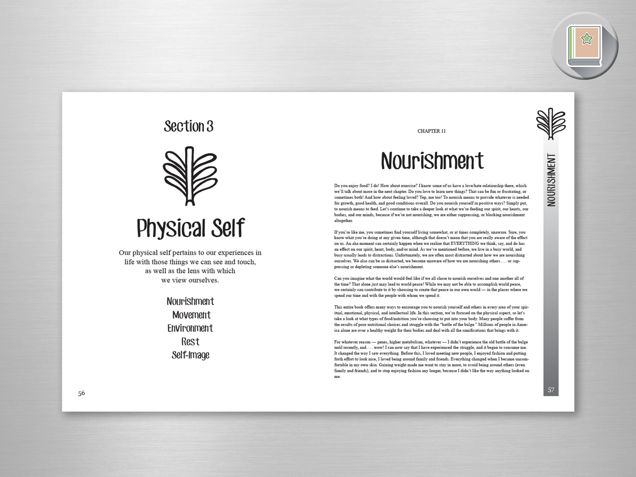
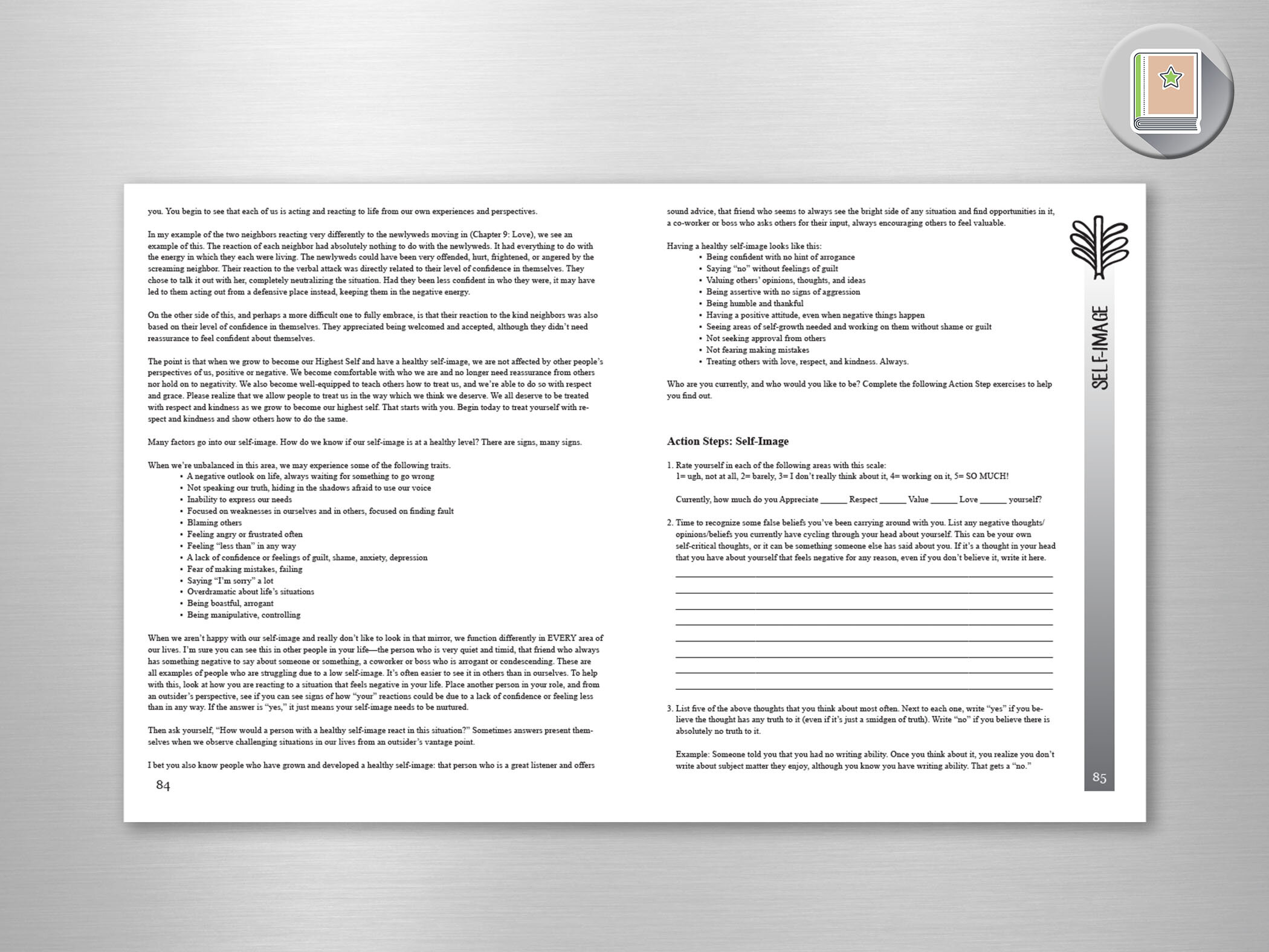
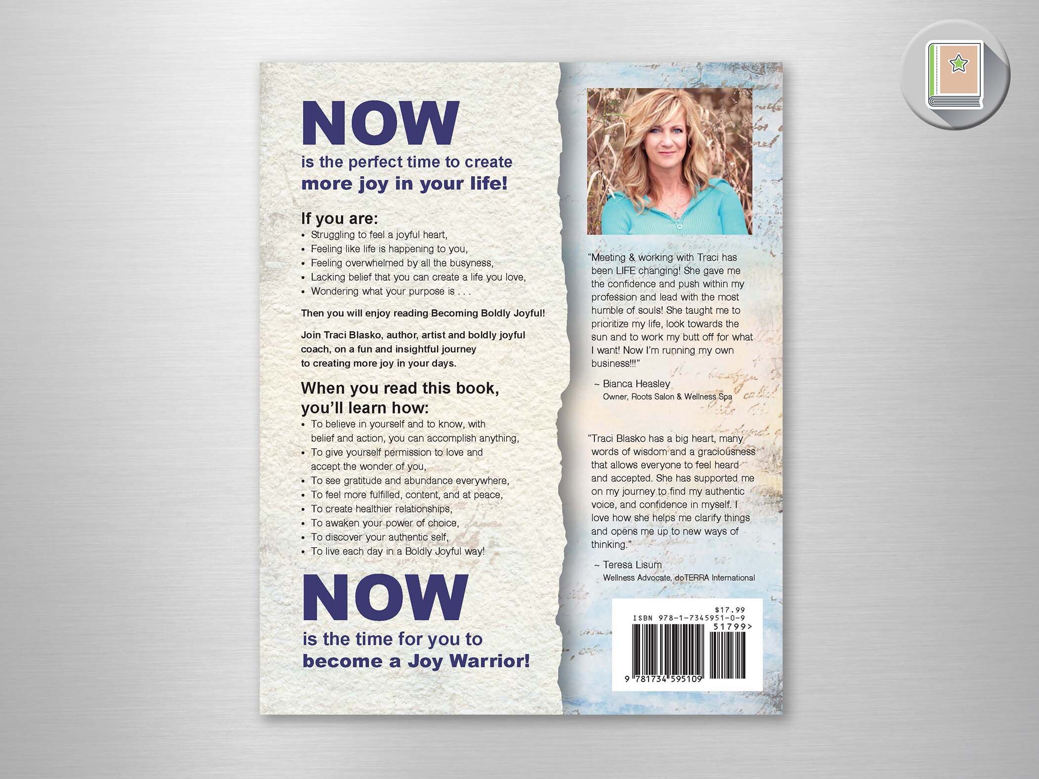
Becoming Boldly Joyful
Book Cover & Book Layout
A work that encourages the reader to create more joy in their life, this book outlines the methods of the author’s journey back to joy! She had established a brand, so I created some icons for her based on her original logo… each representing a different part of the “self” as outlined in each chapter. Each chapter has a sidebar with the icon for ease of finding each different section for the reader.
The base of the cover is a work by the author, who is also an artist. I presented a concept with a stock image of a joyful woman, and the author presented me with an image of her own daughter in a similar pose. I merged the image and added a bold type to bring the cover together.
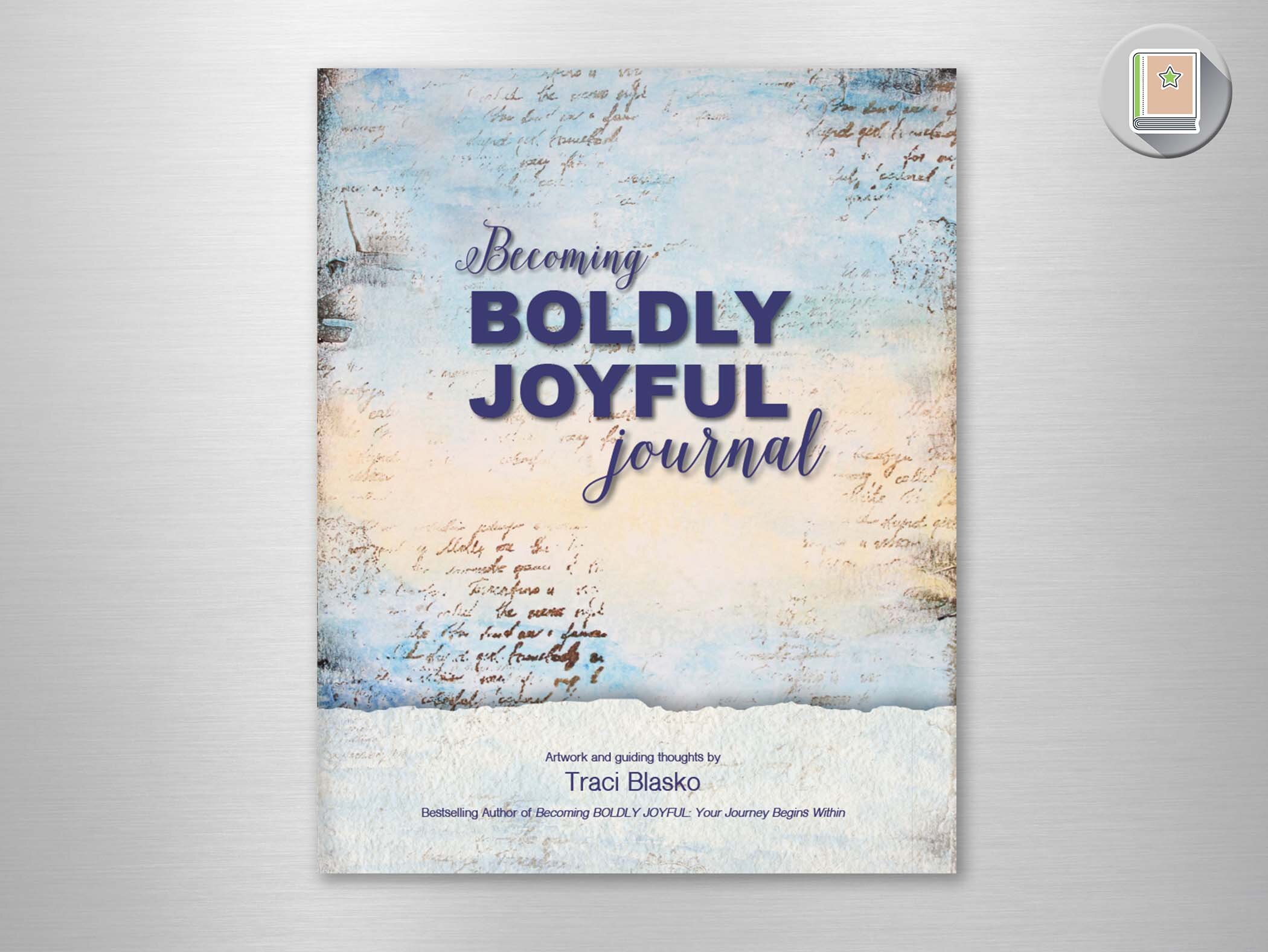
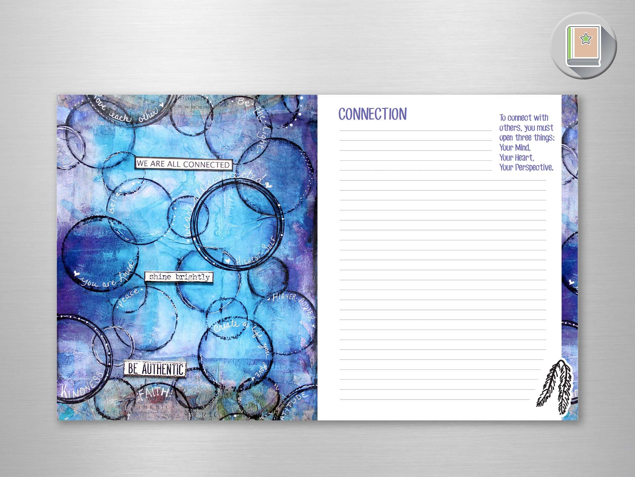
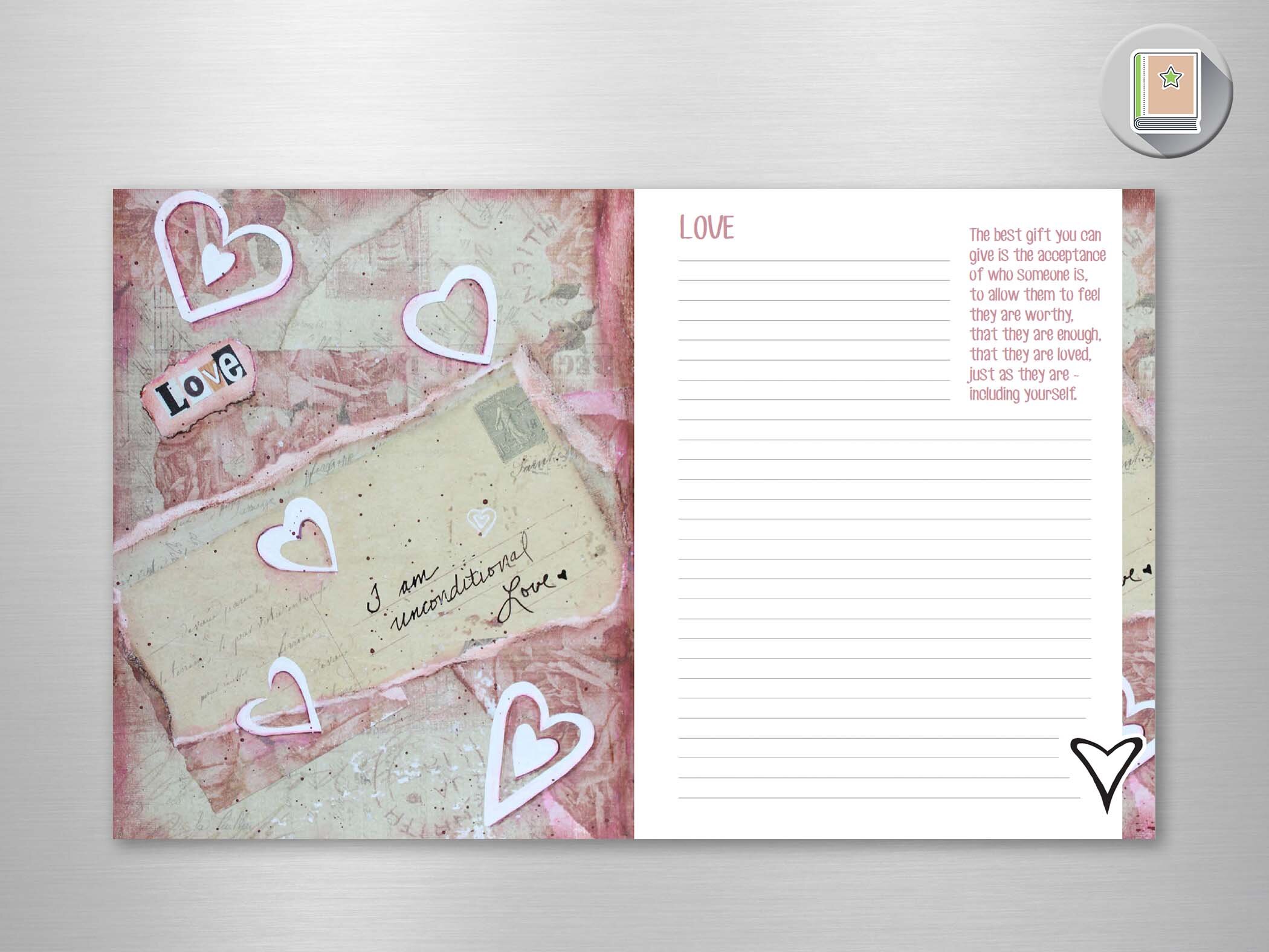
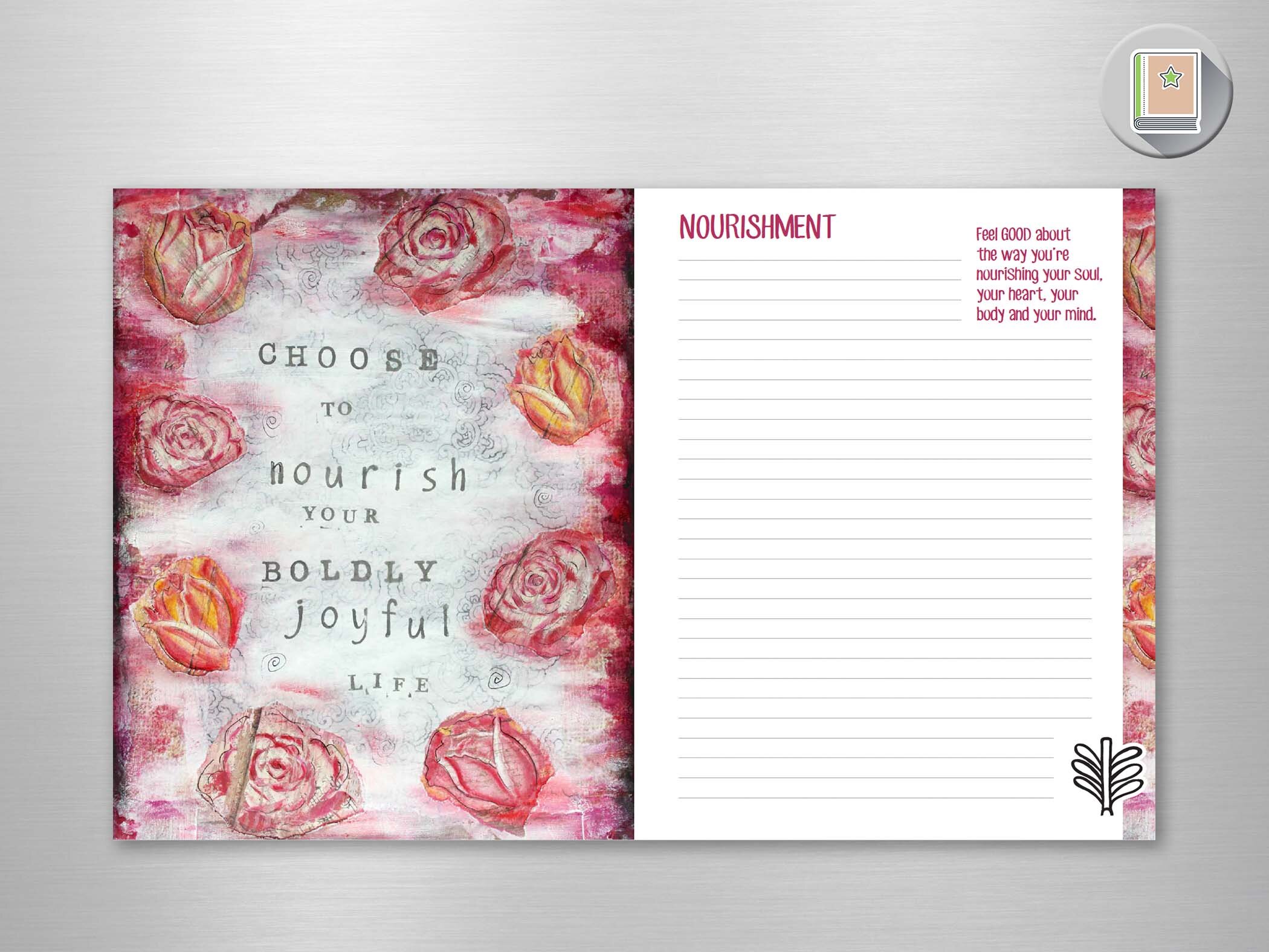
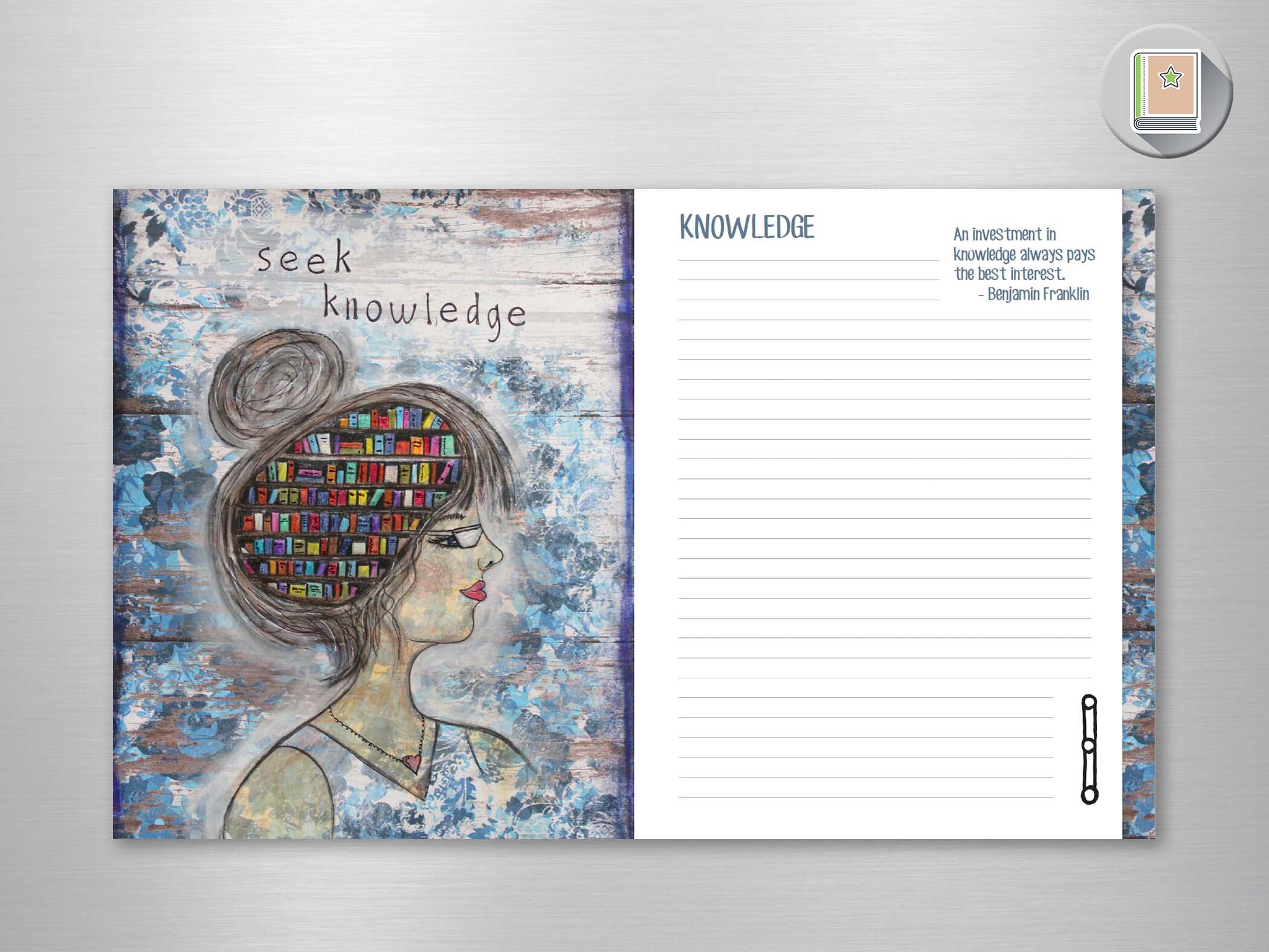
Becoming Boldly Joyful Journal
Book Cover & Book Layout
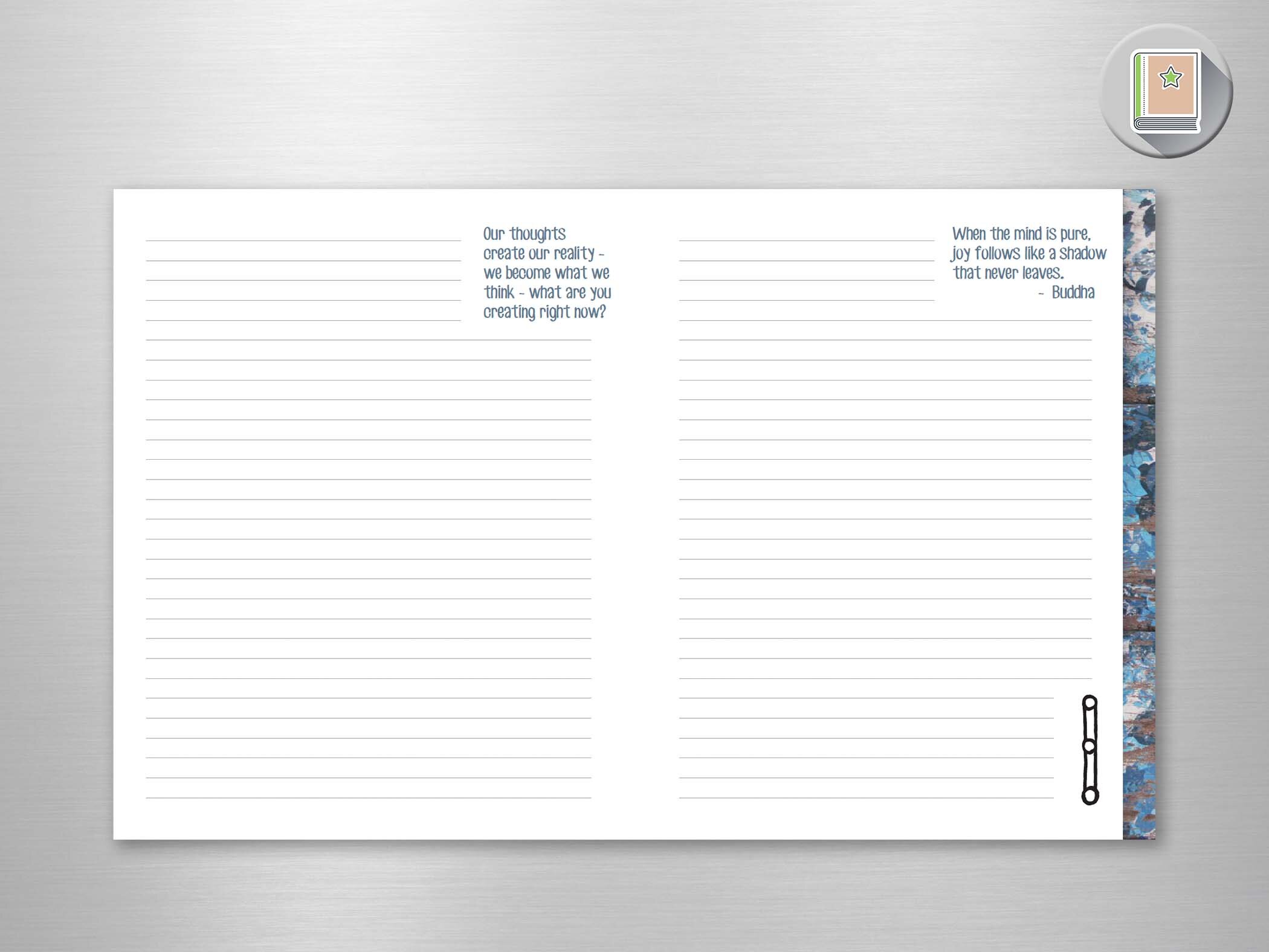
This journal is a companion to the Becoming Boldly Joyful book. The author/artist created a series of works that reflected the chapters of her book and provided me with a selection of quotes to place as inspiration for the writer.
Each layout is unique - reflecting the colors of each image in the type. Each section has the corresponding section/self icon from the original book.
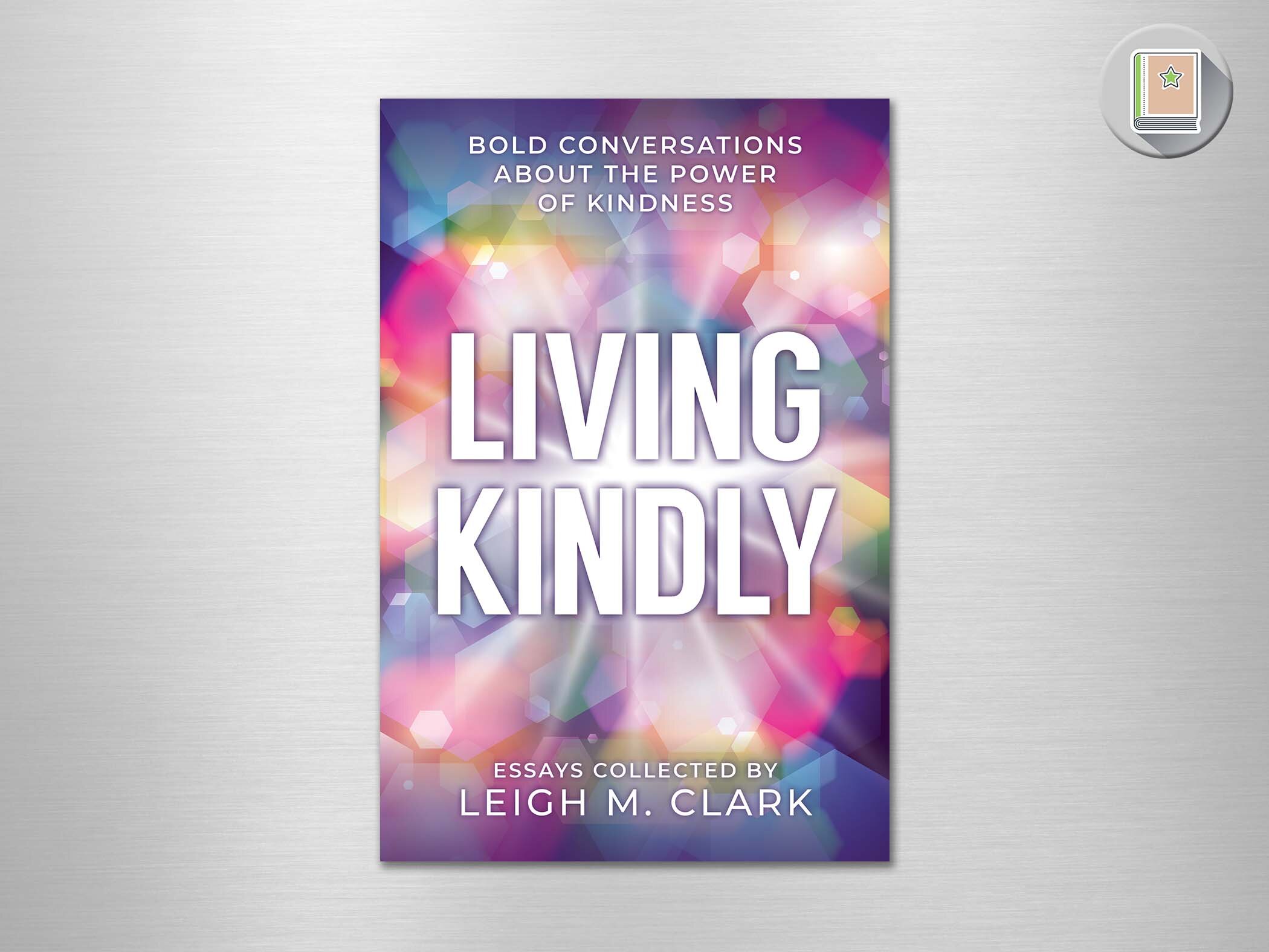
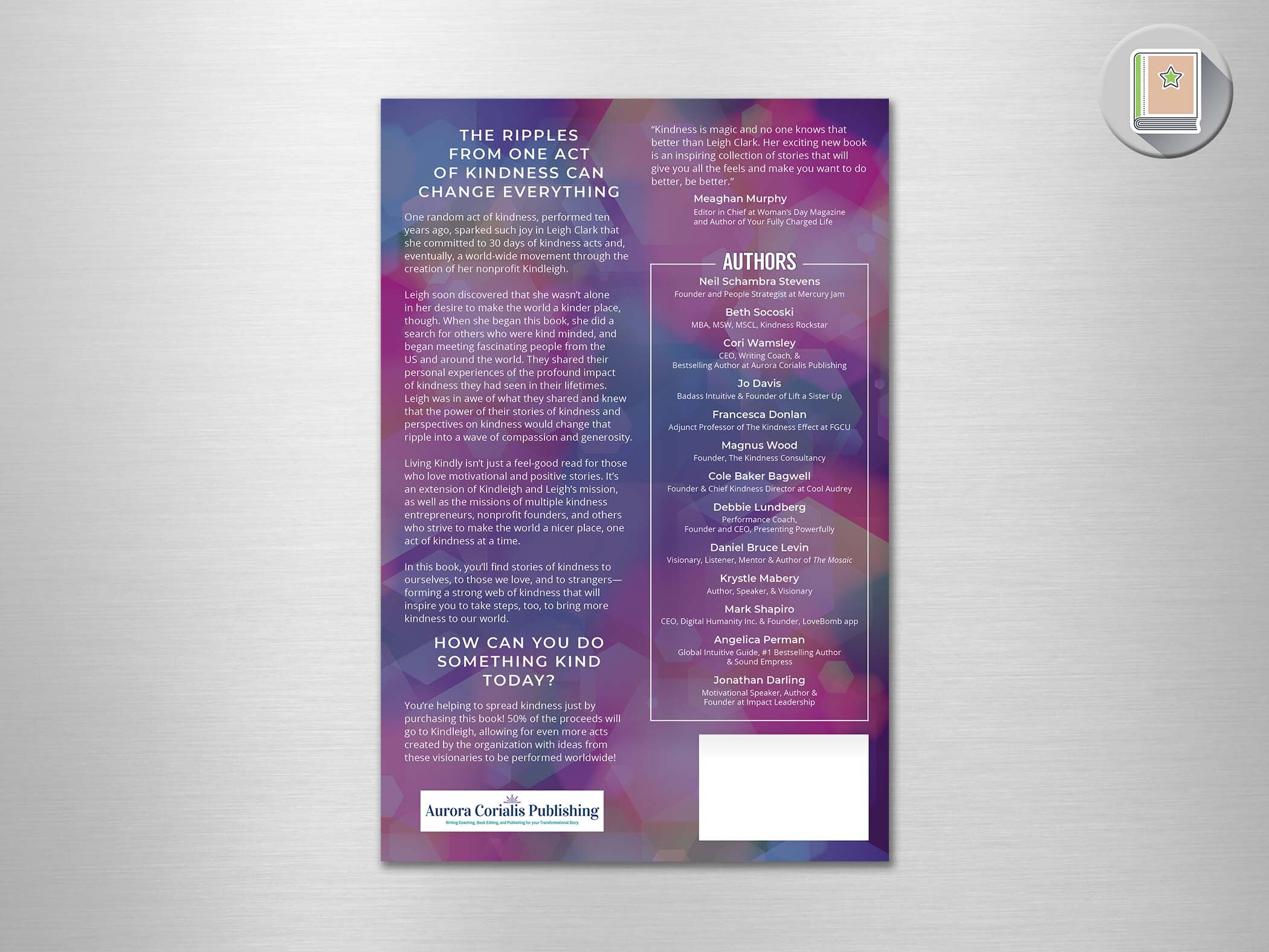
Living Kindly
Book Cover
This cover evolved from a very simple question.
“What does kindness look like to you?”
When it came out of my mouth, I felt like I was asking Katherine Hepburn “What kind of tree would you be?”
But Leigh immediately answered “a Kaleidoscope!”
And we knew we had it. But kaleidoscopes create a very tricky image to work with…and we went through a lot of patterns. During this process, Leigh suggested the white “starburst” that really made this thing literally pop.
The right pattern + the starburst + the bold font = done!
Kindness often is expressed softly. I knew this needed to be bold. Kindness had to step up and be heard.
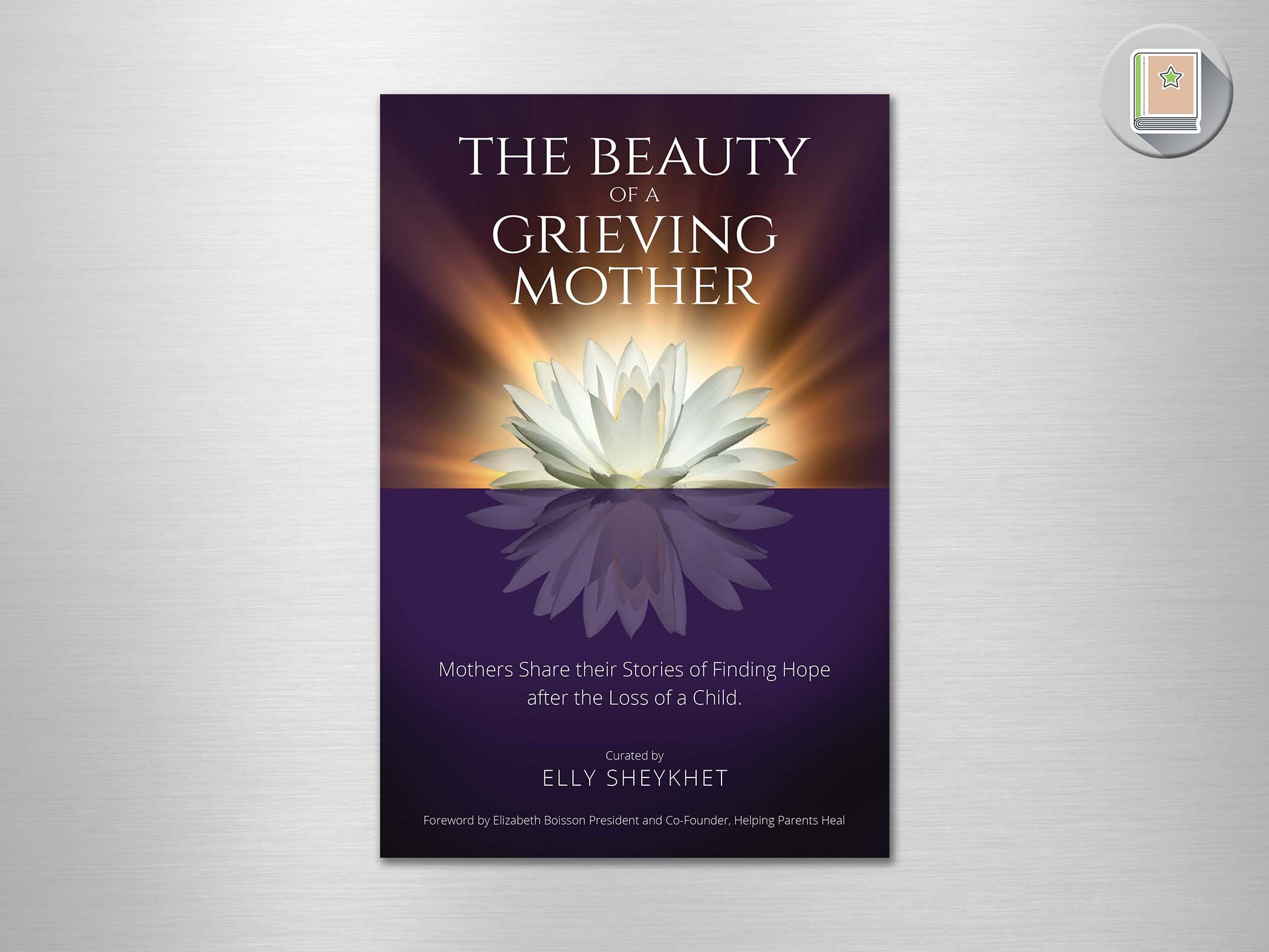
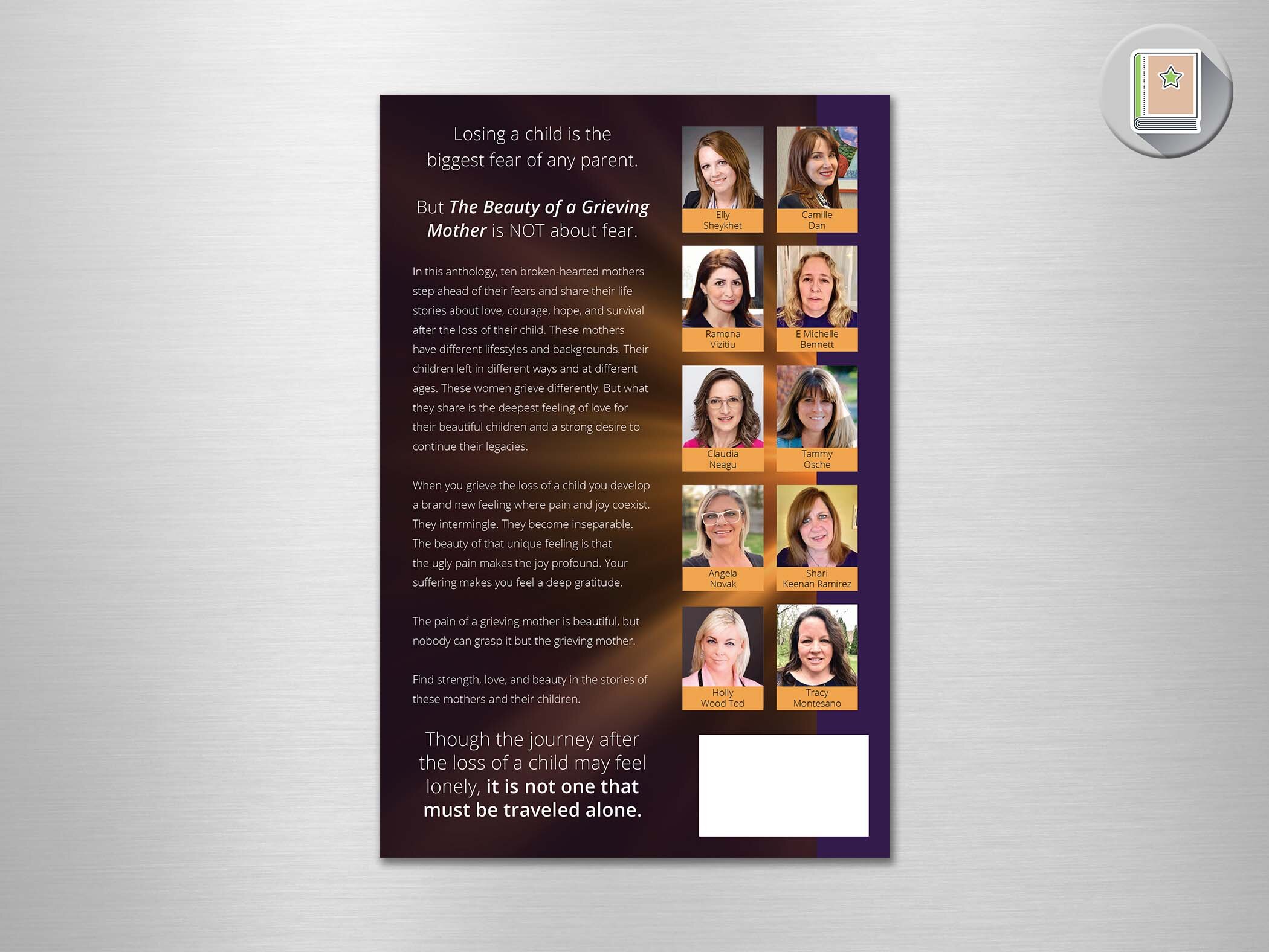
The Beauty of a Grieving Mother
Book Cover
This author had written her story before. A story of a parent’s most imaginable loss and finding hope on the other side of that tragedy. Now she was helping other grieving mothers find their voice by bringing them together for an anthology.
At first we worked on some imagery she had in mind, but it just didn’t come together as something special. I asked her to trust me to try a different direction.
Elly described the inner light that she found in her process, and that is the inspiration I took and expanded on it. There is much symbolically going on here - rebirth, separation and reflection. Coming out of the dark and into the light - emphasizing the inner glow Elly described.
When Elly saw it, she exclaimed, “It’s so unexpected!”.
Mission accomplished.
Embracing your Light as a Highly Sensitive Person
Book Cover
The author is a perfect blend of science and spirituality, so that’s what she wanted to bring to the world. She found herself overwhelmed by her own empathic gifts and once she developed them, she wanted to help people do the same.
She had this “light” imagery as a title, so I ran with that with this gold “bokeh” effect filling the background. As far at the hands go - it was nice blend of a science/pathway/flow feel with the empathic heart.
Strangely, I had already picked the purple before she sent me her head shot. We vibed on this cover from the very beginning!
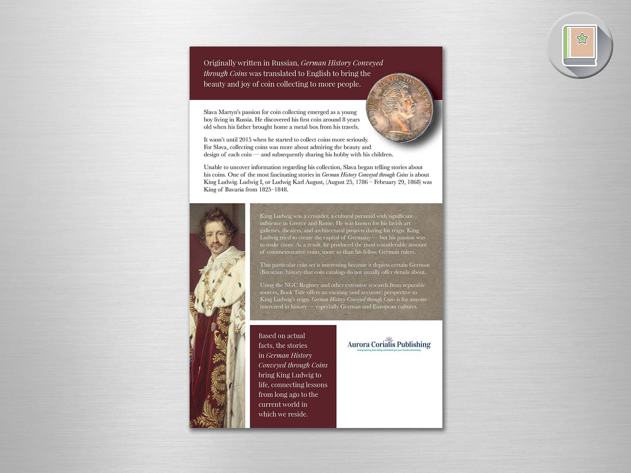
German History Conveyed through Coins
Book Cover
Coins. History. Some might not find those subjects compelling, but when you combine them in the way the authors of this book did, you have something special.
This particular set of coins was commissioned by King Ludwig I to commemorate the events of his reign. Slava decided to create a story about the birth of each coin, bringing each coin and its history to life.
I wanted to evoke that richness in the cover - and luckily a portrait of King Ludwig I provided that lush background. And, of course, I placed an image of one of Slava’s coins prominently on the cover.
I love that the eyes of Ludwig on the coin turn up to his own portrait. How could you not look at that spectacle?
Personal Prosperity Blueprint
Book Cover
The author had a photoshoot of several images that reflected the different parts of his journey to prosperity. He felt strongly about a black, white and red color palette to begin with, and his clothing worked with that theme.
I didn’t want to do a collage, so merged the photos into a single image that reflected his journey. I had the thought of depicting the “pain and passion” in black and white - so the image of him living in prosperity would stand out and be that much stronger.
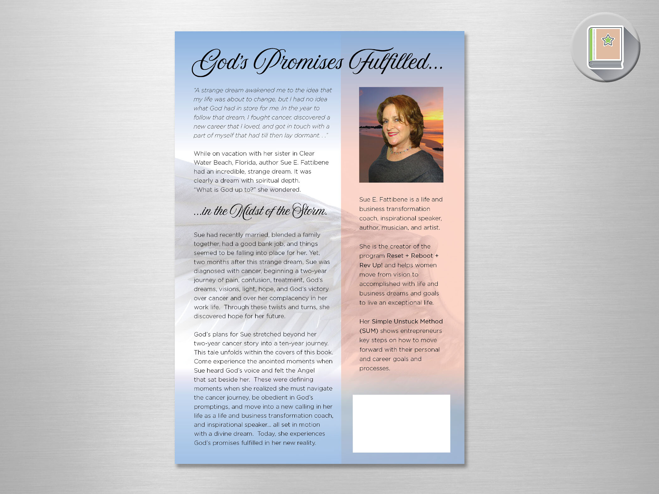
The Day the Angel Sat Beside Me
Book Cover
The author had a photo of herself that she wanted to use - and luckily she was sitting - so I was able to create a literal interpretation of her experience. An angel’s wing reaches out to enfold the author. Adding the radiance of a heavenly presence and strong, but calming colors finished the unique cover for a unique and inspiring story.
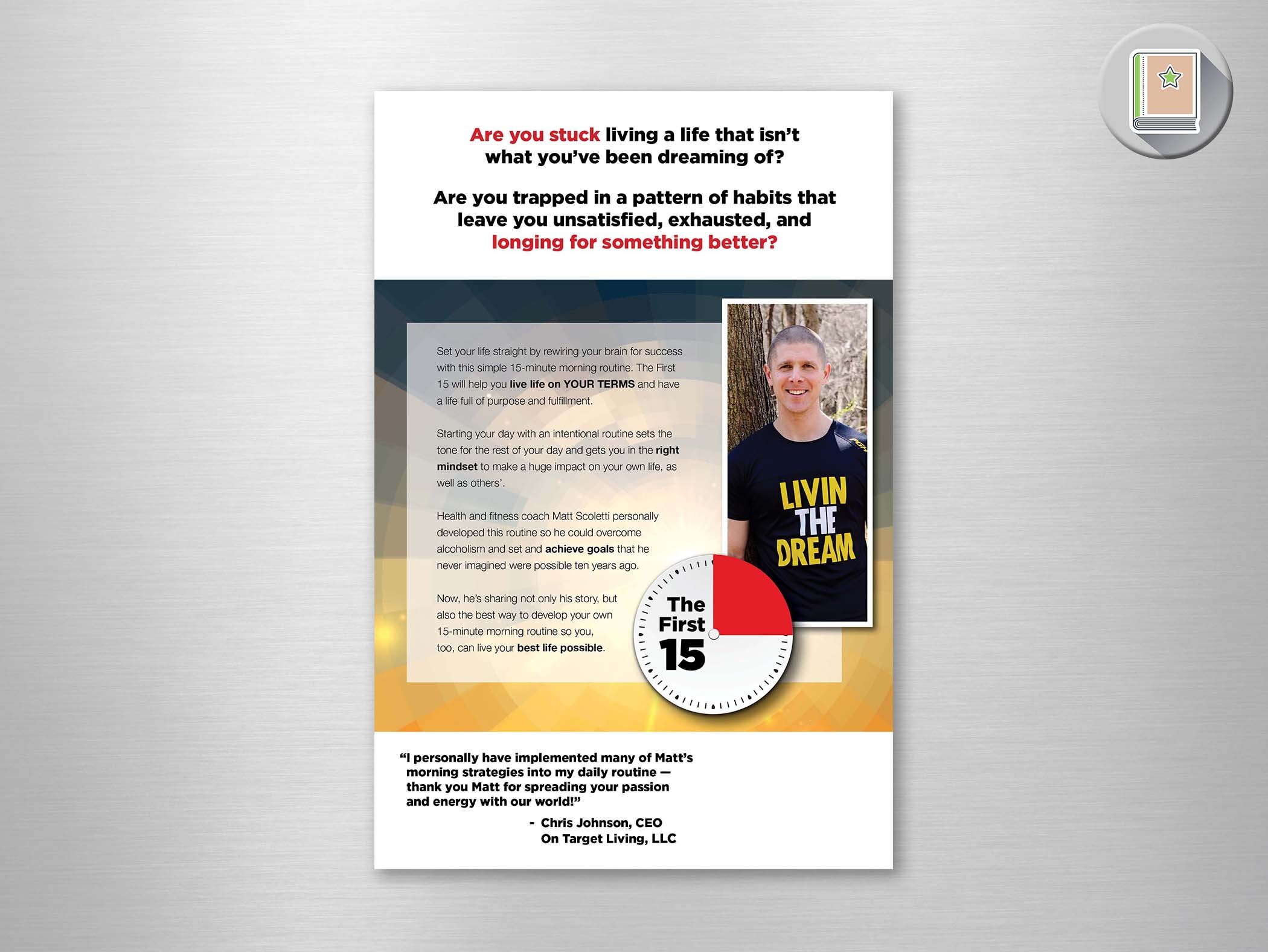
The first 15
Book Cover
Matt Scoletti crafted a routine for the first 15 minutes of each day - generating morning habits that transformed his life from existing to Livin’ The Dream!
The book takes you through his journey and how his First 15 evolved along the way. In developing the look for the cover, I incorporated an abstract depiction of a sunrise - with a geometric circular pattern that would energize the cover and complement the image of a clock face. I indicated the 15 minutes with a bright red which highlighted its importance and worked with his red shirt.
When you meet Matt, his energy and enthusiasm for… well… everything is evident and a testament to his inspiring story. His cover captures that.

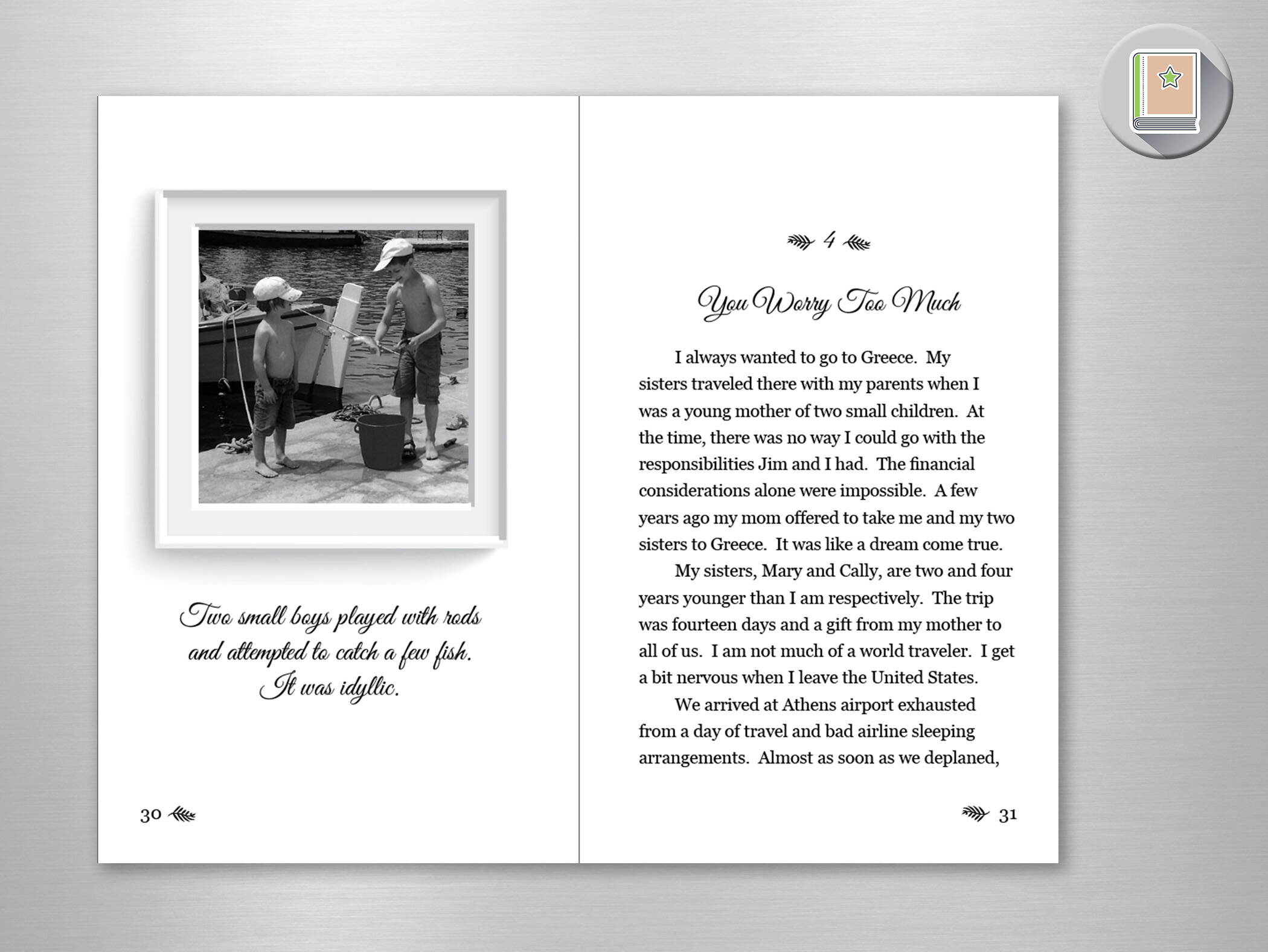
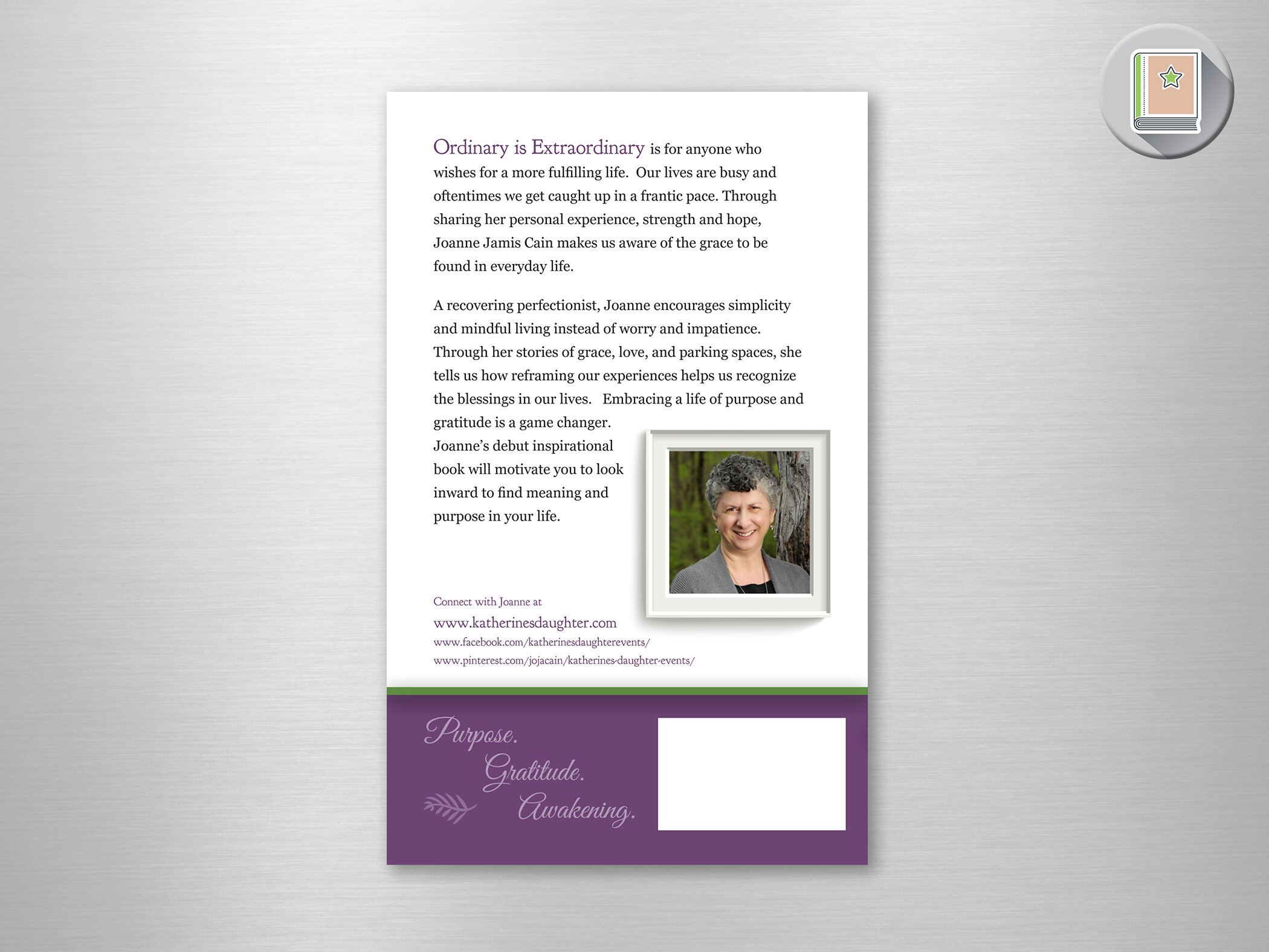
ordinary IS extraordinary
Book Cover & Book Layout
Joanne Cain wanted to use her stories to inspire others to find joy in the simple things. The small, daily gifts that are really the big things. Reframing your life to recognize those blessings brings about big changes.
She wanted to incorporate personal photos, so I used actual frames…things that hold our moments in time to create in interesting cover, as well as to highlight those photos and thoughts at the beginning of each chapter.
Digital Publications
Multi-page booklets displayed online. Click the images to view them!
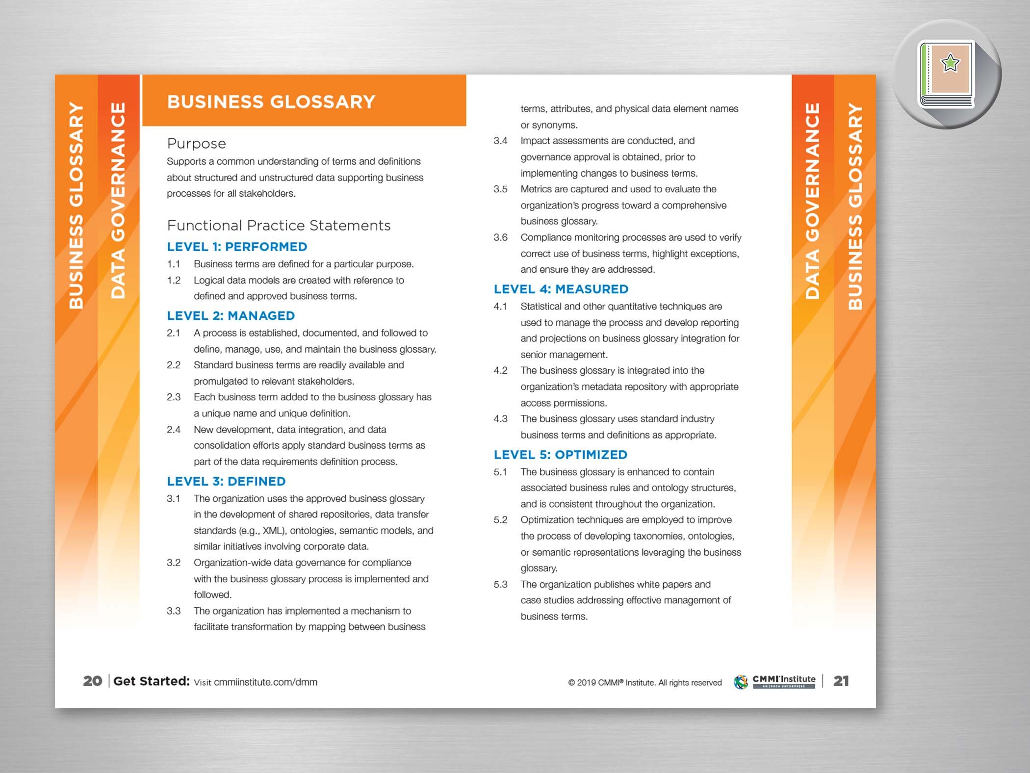
Multi-Page Brochures and Informational Booklets
Newspaper circulars
Before ascending the corporate ladder, I worked for Dick’s Sporting Goods as a page builder. This involved fitting product price and information into tiny boxes while getting images of said products as large as possible… and make it look good!
Because I did that particularly well, when designers were overtaxed, I would be tapped to conceptualize special circulars. These are a couple examples.
I am particularly proud of the Grand Opening one - after all - this was often the first look people would get of the store!


Concept and design of the Grand Opening Sunday Circulars used for approximately 50 Store Openings annually for 5 years.


Major League Baseball Circular. Versioned for each team.

